One of the largest utility companies in the United States enlisted CartoVista’s expertise for their new heatmap application project and develop FERC-compliant public generator Interconnection Queues and Capacity Heat Maps, greatly enhancing access to interconnection information for developers.
In a collaborative effort, CartoVista designed a custom interactive application through a series of Joint Application Design (JAD) sessions with the client. This process ensured a tailored tool that allows users to visually identify potential generation interconnection points, with a graphical interface displaying the estimated capacities on the client’s transmission system.
Introduction to the Heatmap Application
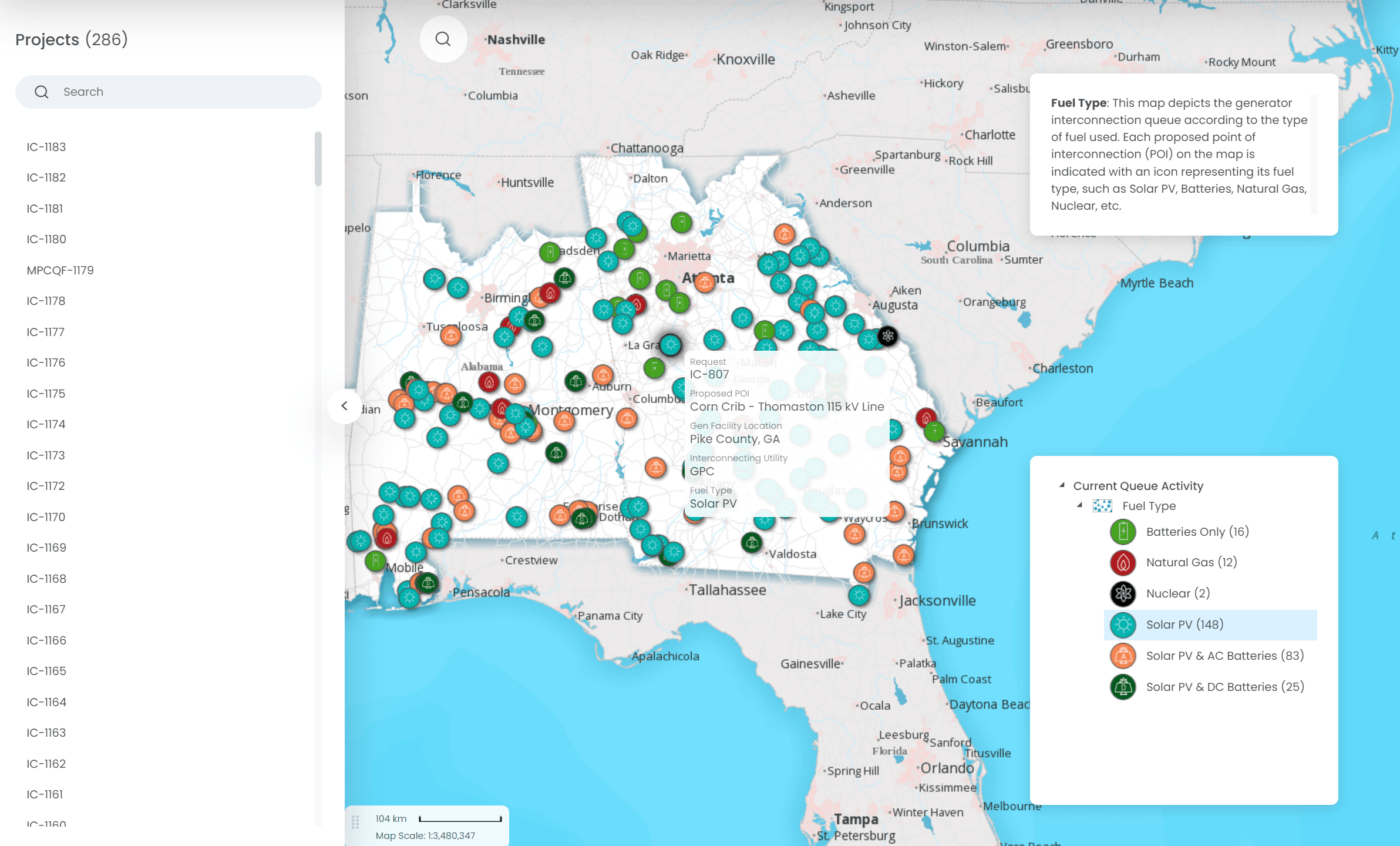
1. Current Queue Activity Map
This map provides a dynamic overview of ongoing activities within the project queue, offering up-to-date insights for effective management and planning.
2. Point of Interconnection (POI) Analysis Map
Tailored for analyzing potential interconnection points on the grid, this map is an essential tool for detailed capacity and feasibility studies.
Both these maps are integrated with a standard base map. This base map was meticulously designed to encompass the full geographic extent of the client’s operational areas, while also reflecting the company's brand identity.
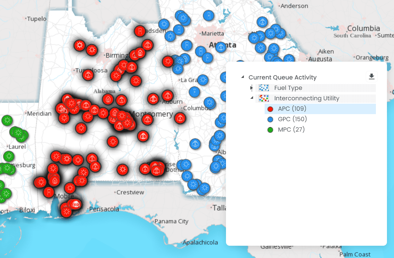
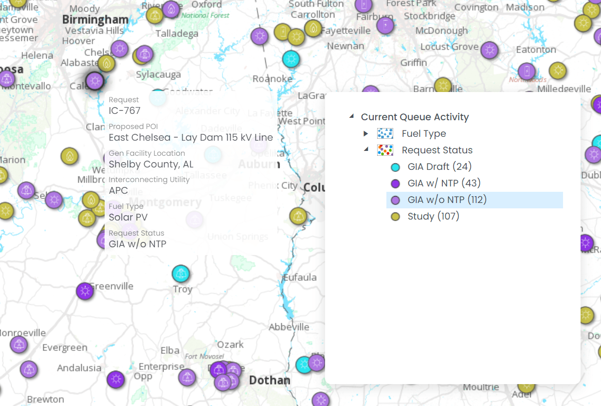
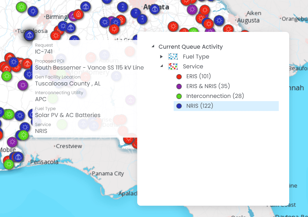
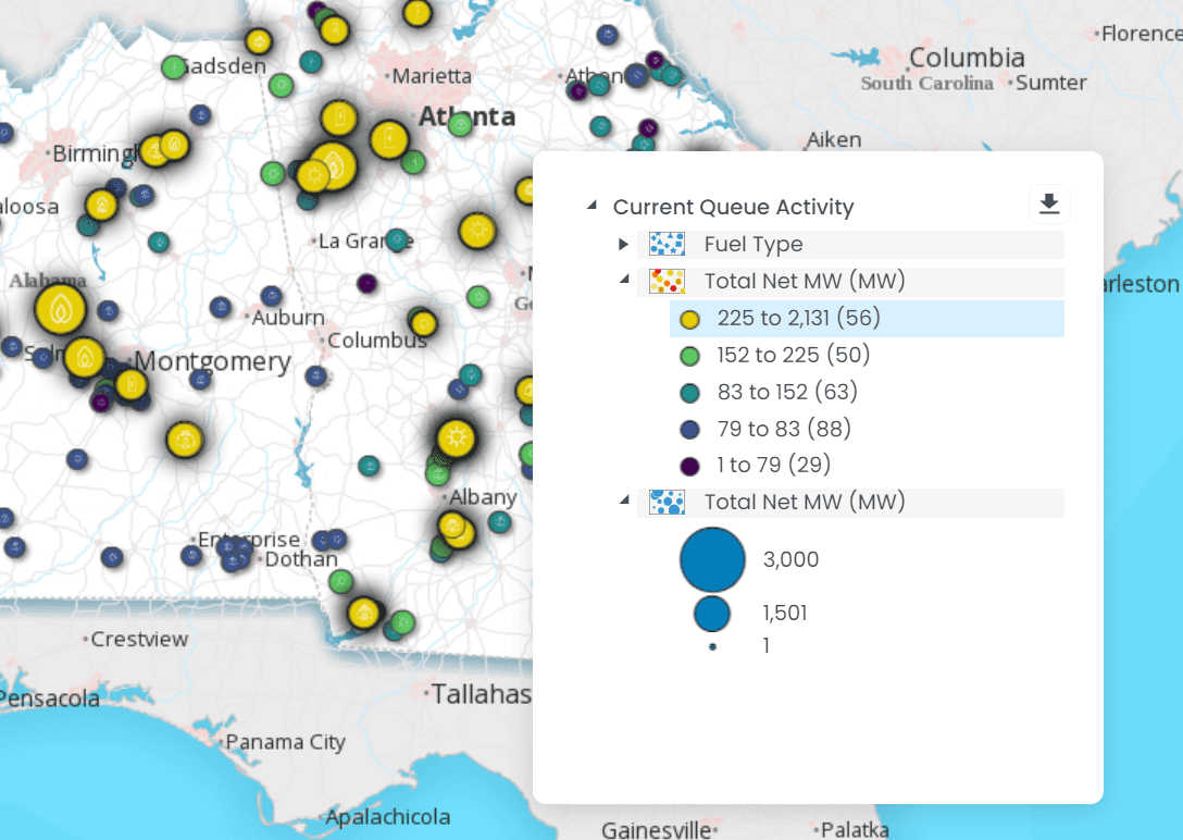
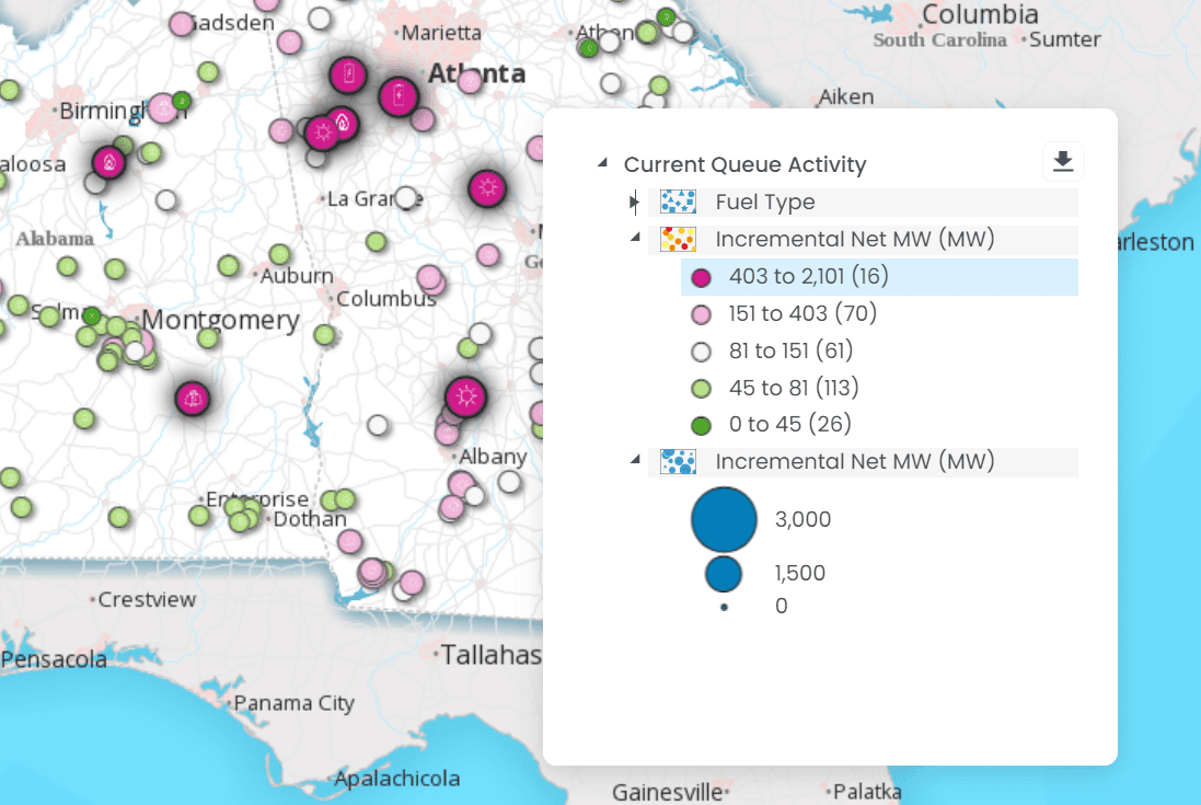
Current Queue Activity Map
The Current Queue Activity Map provides detailed insights into the current status of queue activities. This map is designed to be highly interactive, enabling end users to visualize and comprehend the queue data across various metrics and scenarios. Key features of this map include:
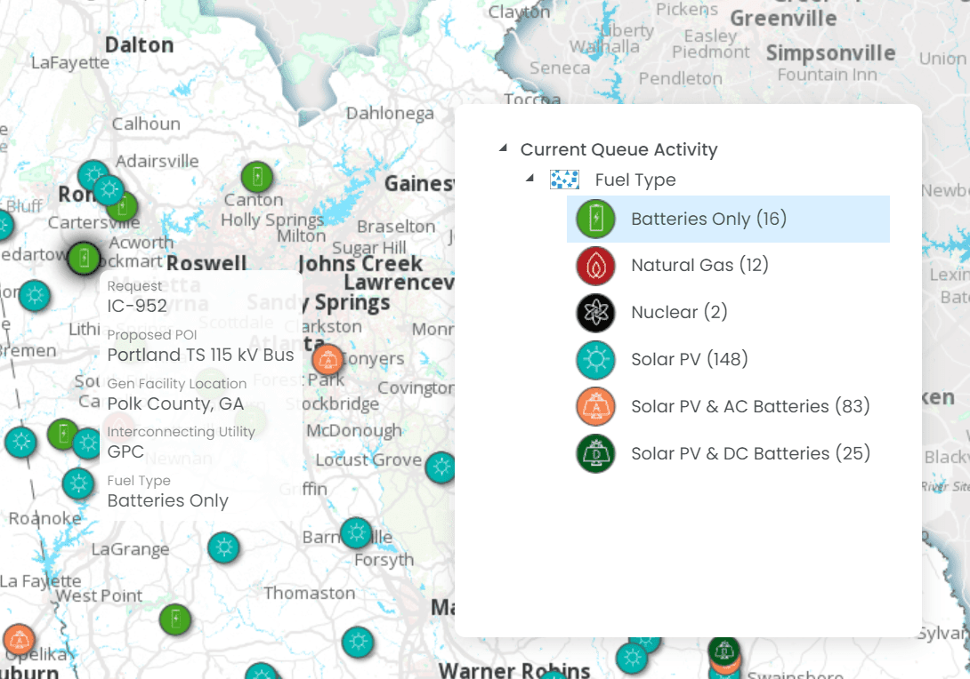
Fuel Type
Users can filter and view projects based on the type of fuel used, such as natural gas, solar, wind, etc. This helps in understanding the energy mix within the queue.
Interconnecting Utility
The map allows for the identification of projects based on the utility they are seeking to connect with, offering insights into the distribution of projects across different utilities.
Request Status
This feature displays the current status of each request in the queue, such as pending, approved, or denied, enabling users to track the progress of various projects.
Service
Users can view projects based on the type of service that facilities have applied for (ERIS, NRIS, etc.)
Total Net MW
This metric shows the total net megawatt capacity of each project in the queue, providing a sense of the scale and impact of each project.
Incremental Net MW
This feature allows users to see the incremental net megawatt capacity added by each project, offering insights into how each project contributes to the overall capacity of the grid.
Is your organization looking to create FERC-compliant heat maps? Download this guide to get started.
This guide will help you:
Review the status of your Geographic Information System (GIS) infrastructure in supporting the creation and maintenance of POI heat maps.
Identify how your organization can address data security and privacy concerns associated with interconnection data used in heat maps.
Discover to what extent is your organization prepared to adapt its heat map strategies to evolving FERC requirements and technological advancements.
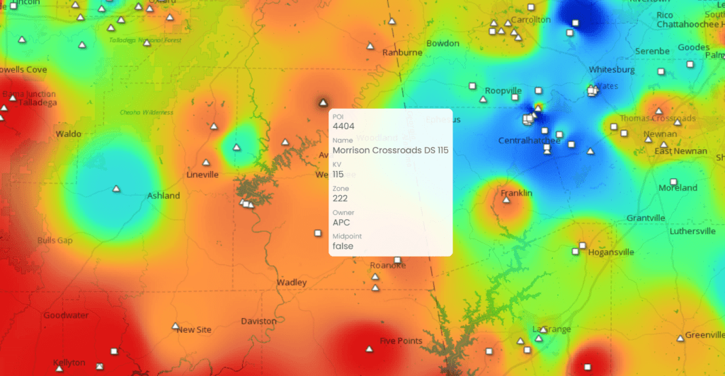
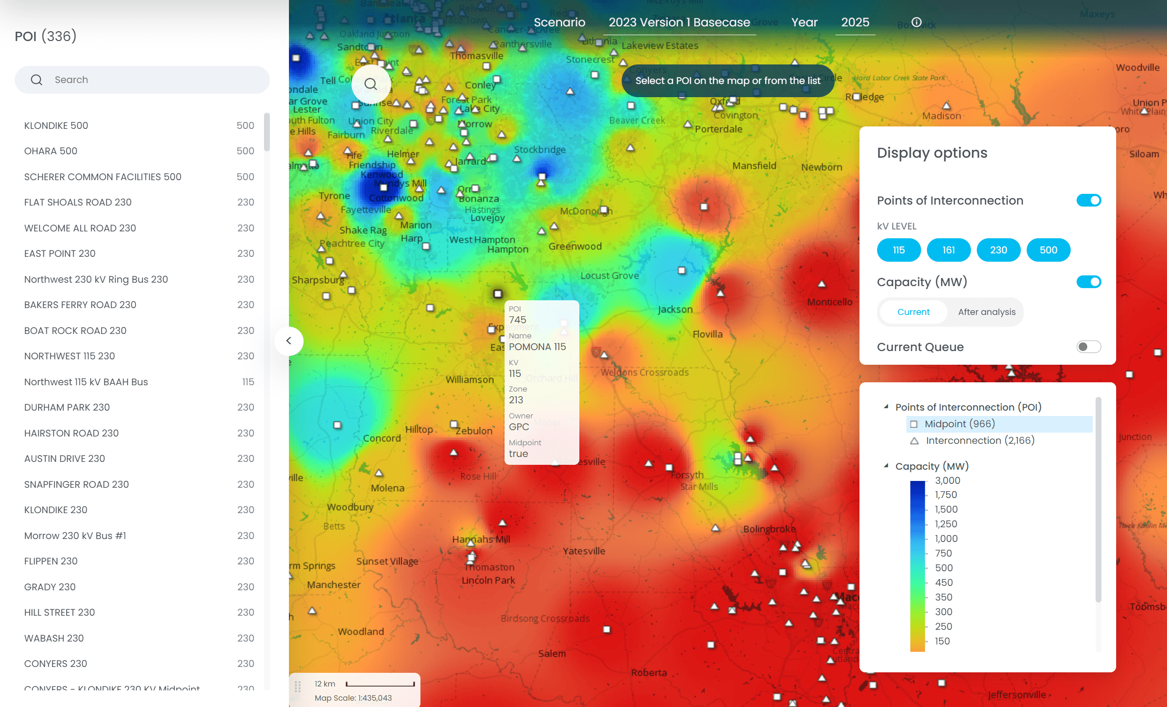
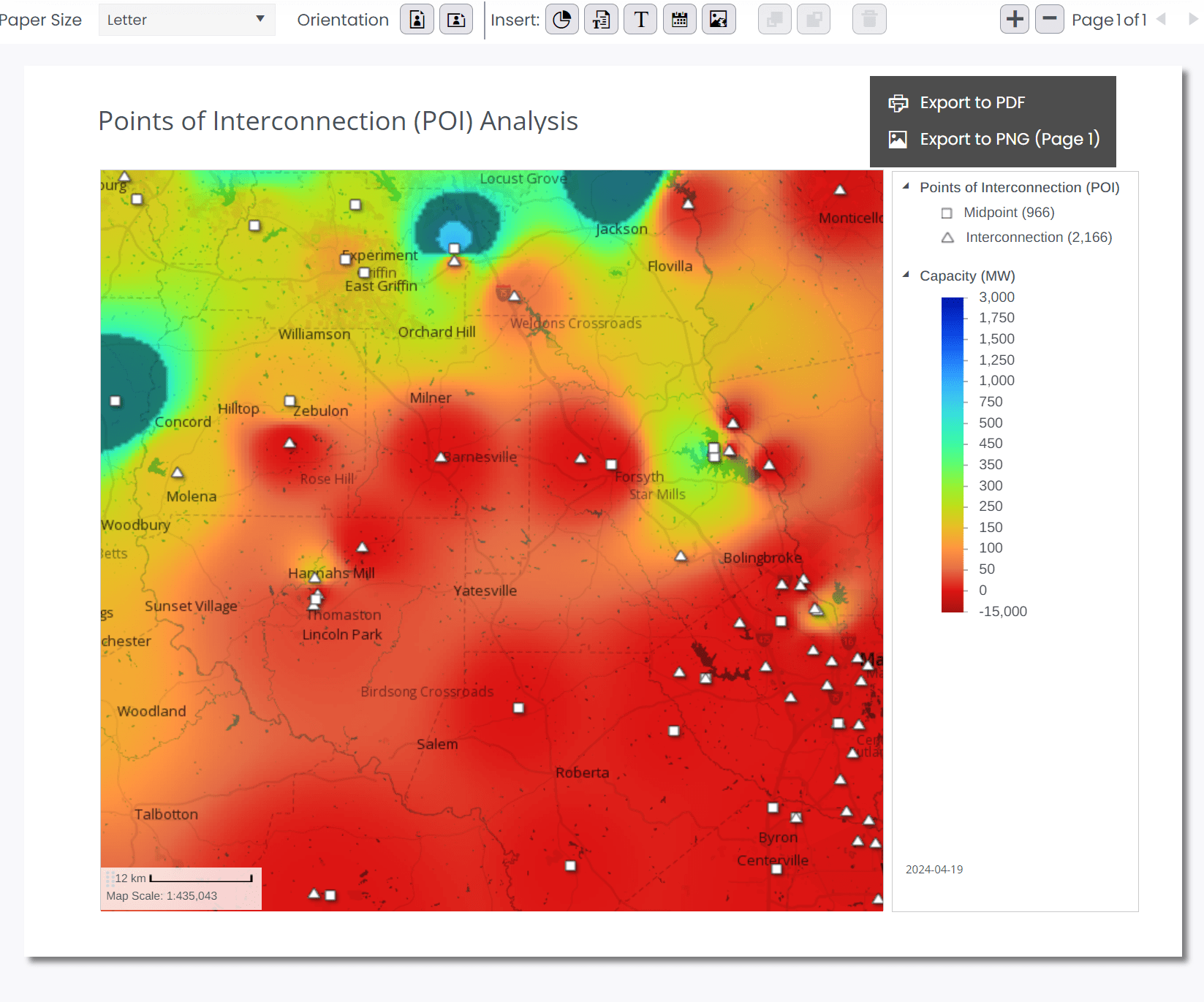
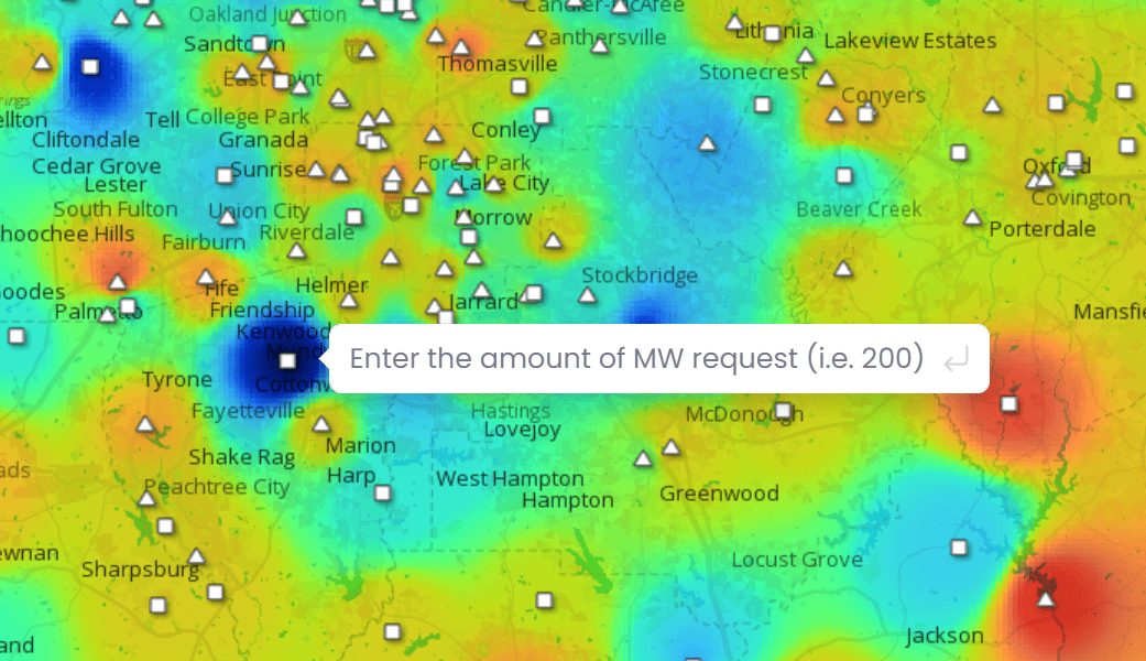
The POI Analysis map displays a heat map that correlates to potential available capacity on the system and allows end users to perform a MW request analysis from specific POIs (points of interconnection) on the map.
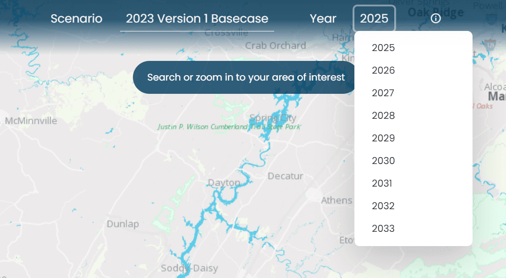
Scenario Analysis
The Scenario Analysis feature in the application offers users an advanced method to model and visualize different grid capacities:
Year and Scenario Selection – Users can choose a specific year and scenario to simulate various grid capacity situations. This flexibility allows for a thorough analysis of how the grid might evolve or react under different conditions in the future.
Visual Heatmap Display – Upon selecting a year and scenario, the application dynamically generates a heatmap that visually represents the capacity in the client’s system. This visual tool is invaluable for understanding the spatial distribution of grid capacity.
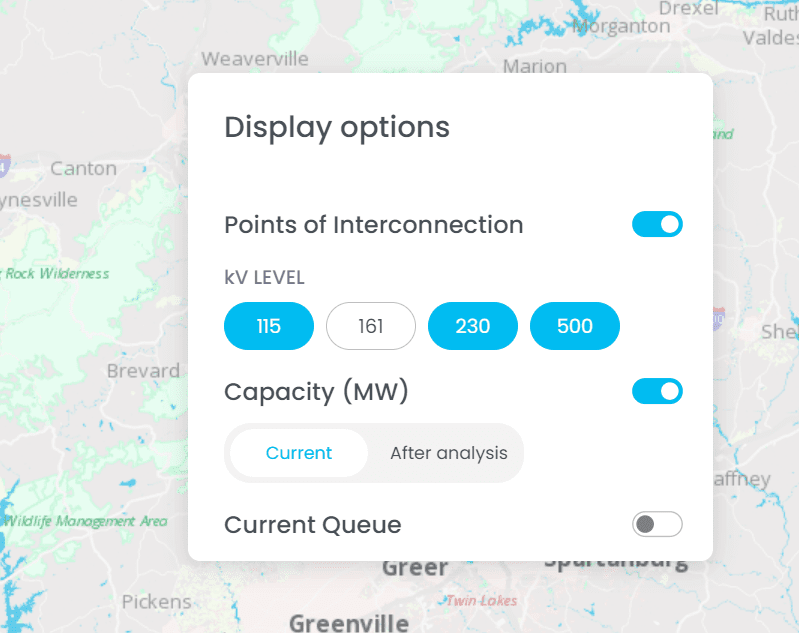
Customizable Display Options
kV Levels: The interface’s kV Level switches allow users to choose voltage levels for analysis, alongside the year and scenario. By default, all levels are selected. Choosing a specific level filters Points of Interconnection accordingly, updating the heatmap. This capability is crucial for precise capacity analysis, enabling informed decisions with detailed data.
Layer Control: Users have the flexibility to tailor their view on the POI Analysis Map by toggling various layers. This includes switching on or off the points of interconnection layers, capacity heatmaps, and the current queue activity.
User-Friendly Search Functionality
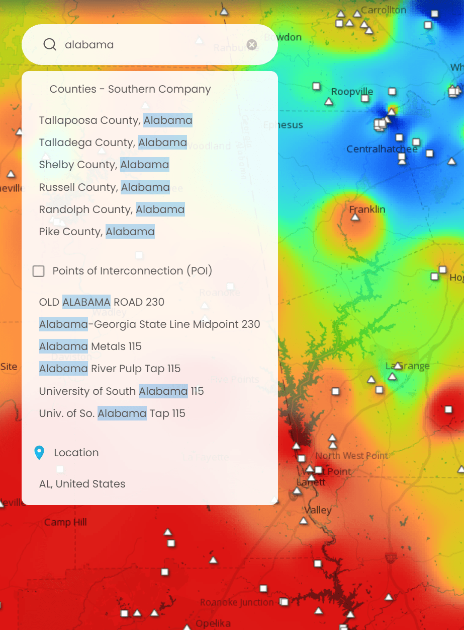
The Search feature in the app improves user navigation by enabling precise location searches using different geographic criteria. It helps users find specific areas on the map quickly and efficiently, catering to diverse search preferences.
County Name and State: Users can enter the name of a county along with the state to focus the map on that particular county, facilitating regional analysis.
City/Place Name: Typing in the name of a city or a place zooms the map directly to that location, providing a more localized view.
Postal Code: Users can search using postal codes, a useful feature for pinpointing areas when the exact address or place name is unknown.
Address: For more precise location targeting, entering a full address brings up the exact spot on the map.
Latitude, Longitude Coordinates: For users who have specific geographical coordinates, inputting latitude and longitude details offers the most precise location-finding capability.
These varied search options significantly enhance the usability of the map, allowing users from different backgrounds and with different needs to effortlessly navigate to their area of interest.
Easy To Export
The Scenario Analysis feature in the application offers users an advanced method to model and visualize different grid capacities:
Multiple Formats: The application facilitates easy export of maps in both PNG and Adobe PDF formats.
Versatility in Usage: These export options make it convenient for users to incorporate the maps into presentations or share them with other stakeholders, enhancing communication and collaborative efforts.
Effective POI Analysis
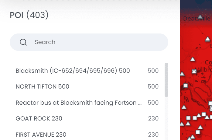
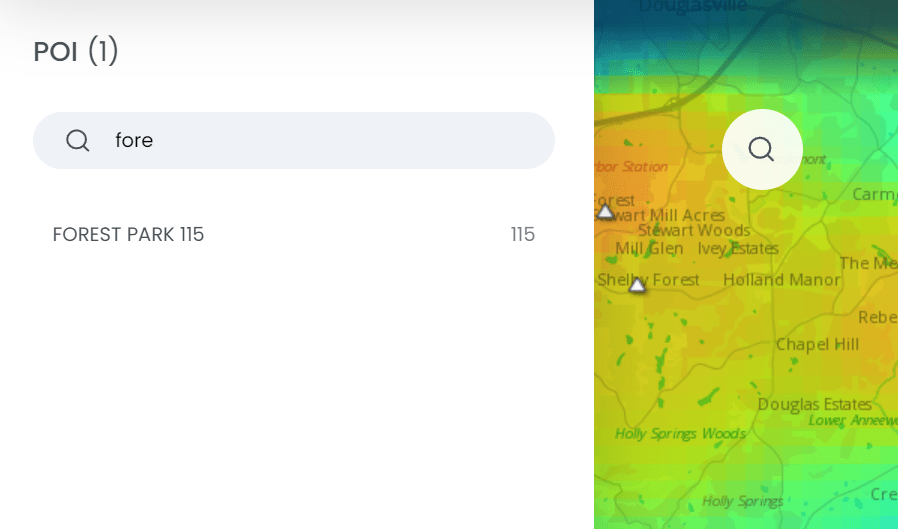
1. Display of POIs
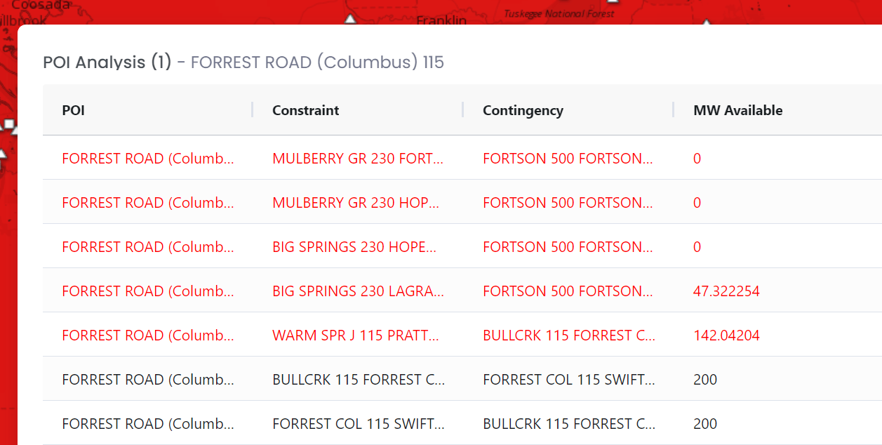
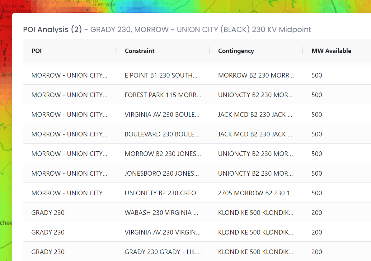
When a user sets specific parameters, the application displays a list of corresponding Points of Interconnection (POIs), each detailed with the substation bus name and kV level.
2. POI Search Functionality
Users have the option to search for a POI by name, enhancing ease of navigation.
3. MW Request Analysis
Users can conduct a POI analysis by entering the desired number of megawatts (MW) for that interconnection.
4. Impact Calculation and Visualization
After entering the MW request, the application calculates its impact on the system. An updated heatmap is generated showing the injected MWs, and a detailed table provides insights for the selected POI. For POIs with overloaded lines, additional data like Transfer Distribution Factor (TDF), MW impact, and line loading percentages are displayed.
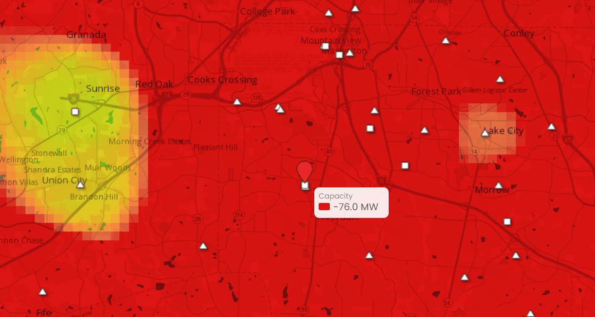
5. Dynamic Color Coding
POIs on the map change color based on the status of the analysis, such as Normal Load or Overload, providing a quick visual reference.
6. Cumulative Impact and Overlay Options
If multiple locations are selected in a session, the results table and heatmap reflect the cumulative impact. Users can also overlay the Current Queue activity layer for a more comprehensive analysis.
Key Results
Enhancing data transparency and FERC regulatory compliance
CartoVista’s partnership with the client resulted in FERC-compliant generator interconnection queue and capacity heat maps, greatly improving accessibility and transparency for developers.
Positioning the client as a leader in innovation
CartoVista played a crucial role in boosting operational efficiency and stakeholder engagement, helping position our client as an industry leader in mapping solutions.
Establishing a new benchmark for complex data visualization
This mapping application is a testament to CartoVista’s ability to transform complex data into actionable insights, making it a valuable ally in the energy innovation sector.
Deploy Your Heat & Queue Maps With CartoVista
CartoVista can help your organization deploy interactive maps that are fully compliant with FERC Order 2023. Here’s why clients love our platform.
Ease of Use
CartoVista is designed with the user in mind, ensuring ease of use without compromising on functionality.
Customizable Features
Tailor the map experience to suit your organization specific needs and preferences.
Easy Scalable Deployment
The CartoVista platform is designed to scale and offer the best online experiences either in the cloud or on your own premises.
Better Insights
Leverage the power of data to make informed decisions and streamline all your transmission planning communications with interactive maps.
Data Visualization
Enhance the user experience by crafting engaging presentation slides and dashboards that tell a compelling story.
Ongoing Support
Our team of experts is always here to assist you, from initial setup to regular maintenance, ensuring that your project is deployed on time and on budget.
Get in Touch
Kindly complete the form to schedule a call with our team of solution experts to explore your requirements and preferred timelines.
Get The Guide
Please fill out the form below to get your copy of the FERC Order 2023 Mapping Readiness Guide.